
Image Analysis
Study created as part of: “Constructing the Gestalt” - Undergraduate Thesis - Virginia Tech (2015-2016)
The three main concepts contributing to the desired sense of place (boundary, proximity, and variability) are tested against images with a strong demonstration of visual gestalt principles. Explorations of boundary, proximity and variability in architecture have led to a formulation of the characteristics of a spatial gestalts. These three concepts also manifest themselves in paintings, illustrations and photographs but remain in the two-dimensional realm. This analysis seeks to distill, through the role of these three concepts, spatial ideas latent in these two-dimensional representations.
Architecture’s infatuation with the visual seems to be an inescapable truth. Perhaps though, there is value in careful analysis of two-dimensional images as representations of spatial orderings. A two-dimensional image can represent a rich idea when it manifests itself in three dimensions, thereby making a case for the abstract two-dimensional realm. These images are analyzed beyond a simple one-to-one translation of what they represent. Each image contains an order or hierarchy organizing the different elements on the page. This order gives purpose to the composition and gives this collection of elements meaning beyond their individual qualities. The unseen ‘third’ in these images is the gestalt.
01
This image introduces the idea of simultaneous contrast as a means of creating a third condition. The composition is a series of squares within a square. Each row of squares is the exact same tone, but the changing background creates the illusion that the individual squares might be different tones. This image is compelling because if the background is understood as the context for the squares it could be postulated that the context is affecting the perception of the content. Throughout the thesis the relationship of these elements and an overlaid force has been examined. The relationship between the context (background) and content (elements) creates a third condition in which the whole is perceived as twenty-five unique squares on a background as opposed to five rows of squares with different tones.
This brings into consideration the relationship of the building and the environment it is placed within; specifically, how the building might oscillate as expressive of its architectonic language and maintaining an analogous relationship with the site. Simultaneous contrast of the architecture relative to itself and the landscape could contribute to this greater sense of place.


02
In this specific example there are three distinct elements at play. The first is a series of vertical blue rectangles equally spaced apart. A second horizontal, teal rectangle is overlaid on all of the blue rectangles which have varying levels of opacity. On the left side of the image the blue rectangle appears in front of the horizontal rectangle while on the right the rectangle appears to be inside the horizontal rectangle. Finally, the inclusion of an aqua-colored background helps mediate the condition at play by giving the composition a grounding element. Instead of allowing the rectangles to float on the white page they are given a ground, or context, within which they are composed. Variability is obviously a force alternating one’s perception of the whole, but the proximity and consistent orientation of the blue rectangles allows them to appear as a system affected by another entity.
Recalling Greg Lynn’s thoughts on the context for design, this image could be read as a storing of dynamic forces in its form. Specifically, the changing opacity of the blue rectangle as it intersects the teal bar is evidence that one is changing the other. A composition of elements becomes varied and specific to a place when a force changes or affects the composition. When that composition can still be perceived as if the force was not present a strong relationship between the architecture and the dynamic forces of the place has been achieved.

03
This series of images is a deconstruction of a Victor Vasarely’s “Keple Gestalt” to understand the various scales at play in the original image as well as the parts that make up these scales. The axonometric projection of the object sets the image up to be dissected into its three construction planes. Additionally, the choice to have each surface be a composition of elements with varying color establishes another scale within the image.
At first glance there is an immediate oscillation in perception that occurs at the two red points in the top-left image. These are the key intersections that bring a gestalt quality to the image. The two points are the result of an intersection of three planes, each made up of smaller elements as shown in the middle-left image. These elements then carry degrees of variation within their respective planes through color differentiation. Each surface of the larger image can be understood as a whole made up of parts which is represented in the bottom left image. The composition is a rich interplay of the gestalt manifesting itself at the scale of the unit, the surface and finally the whole composition.
The architectural parallels are quite obvious when the structure of the image is understood as a hierarchical model for architecture. Smaller pieces cooperate to form buildings within a composition. The smaller pieces are varied, but their form clearly articulates a building. The building in question is also a smaller piece of a larger composition, and the relationship of all the buildings creates moments of perceptive oscillation, where it is understood that something else is present without ever physically existing.

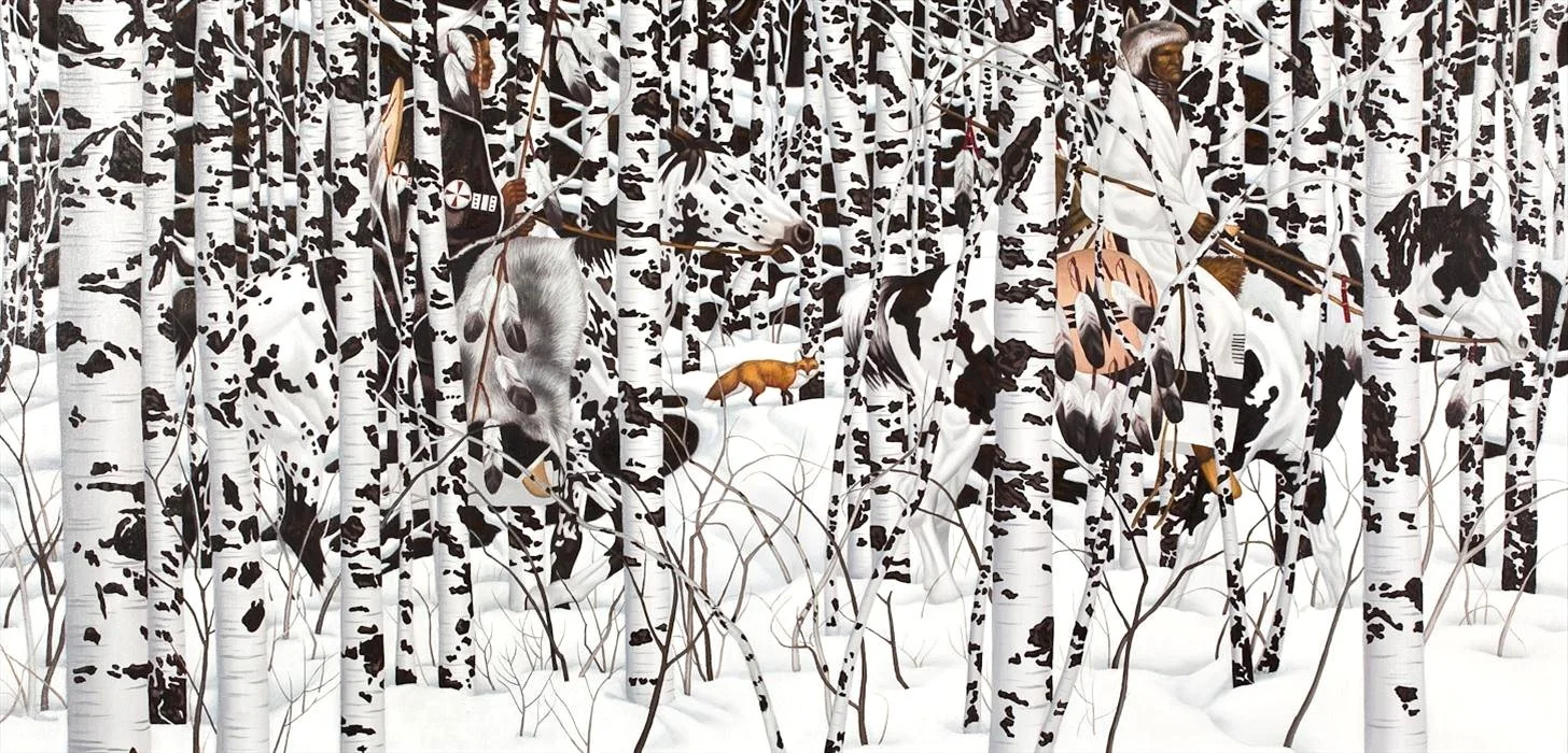
04
“Woodland Encounter” by Bev Doolittle
This image is representative of Bev Doolittle’s larger body of work consisting of American western landscape and nature paintings. The gestalt manifests itself through perceptive oscillation and the hierarchy of elements within the painting. The top image shows a scene with two Native-Americans riding horses that are being followed by an orange fox. The ‘spotting’ on the white horses blends them into the surrounding trees forcing the viewer to differentiate between the layers of the painting from each other.23
On the bottom image a threshold was applied to represent the relationship between positive and negative space in the image. The result is an image that is fragmented by the form and spots of the trees. It is important to note the similar shapes between the spots on the trees and the horses providing the camouflage. This camouflage, however, is broken by the form and boundary of the individual trees.
The boundary of the trees enables the distinction between the context and content. Variability between the spotting of the trees and horses is apparent but the similarities in color blur the boundary. The relationship of the landscape to the architecture can have analogous qualities, but boundaries between the two can be opportunistically manipulated to create cognitive oscillation.

05
“Homage to the Square” by Josef Albers
This series of paintings is an experiment in the perception of color and the effects of simultaneous contrast. The result is an advancing or receding of space in the image through subtle contrast of color. The image could be perceived as a representation of a space with depth or a series of squares nested within each other. Additionally, the relationship of the colors to each other affects the viewer’s perception of the actual colors at play. This is an excellent embodiment of a gestalt, whereby the proximity and variability of the parts creates a third condition that cannot be achieved if the pieces were separate.
This series of paintings introduces the idea that two parts do not have to directly contrast each other. Contrast between two parts is static, however contrast between three or more parts creates the simultaneity Albers achieves in these paintings, which could be a powerful architectural experience. Differentiation between three variables also speaks back to similar levels of complexity Grey Lynn discusses in Animate Form regarding the performance envelope.

© Forrest Bibeau, 2022